Project 01
Redesign of the categorization, filters, and results section of a classified ads website.

Project 01
Redesign of the categorization, filters, and results section of a classified ads website.
duration: 2 months
tools: figma
solo project

introduction
Context Kupujem Prodajem is an advertising platform that originally focused on buying and selling used items. Since 2021, it has grown to include job searches, real estate, book rentals, and more. As an occasional visitor to the website, I noticed several areas where improvements could be made. Considering the size of the site, I decided to focus on a specific section to enhance its functionality.
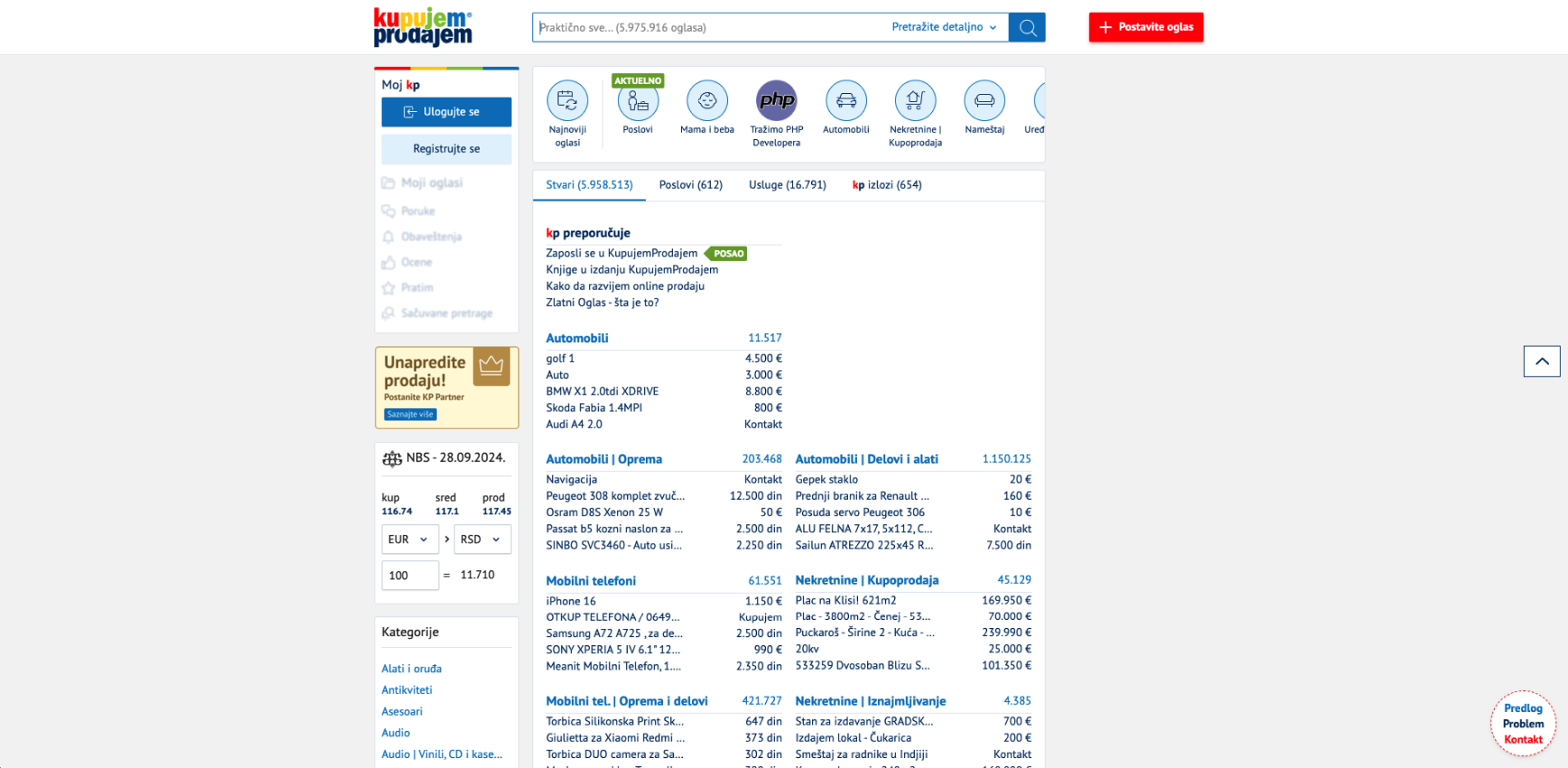
Project goal After testing the site's basic functionality, I identified several areas for improvement:
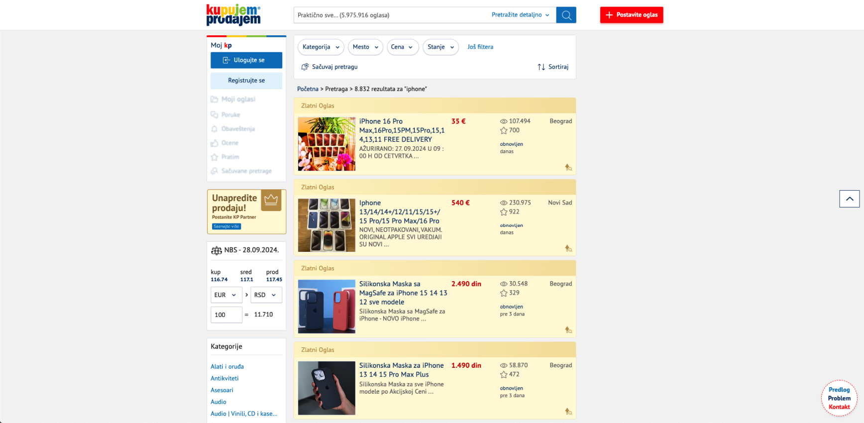
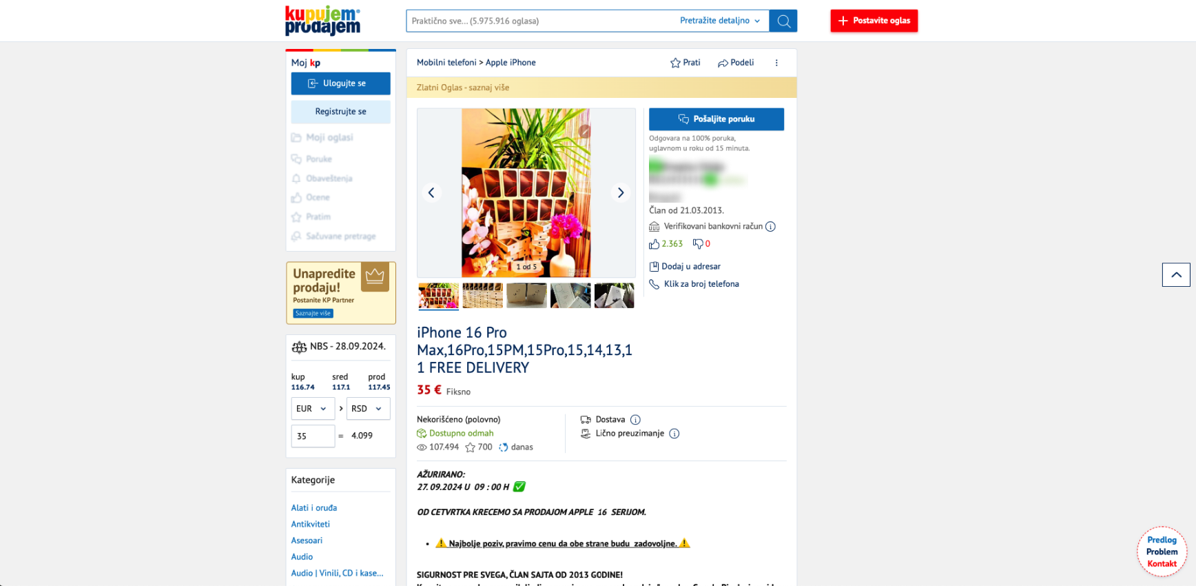
current design


research
Getting familiar with users
Using tools to track and analyze website activity, I gathered data on users' ages and genders. The results showed that about 70% of users were men and 30% were women. The largest age group was between 25-34 years old (25%), while the remaining age groups were fairly evenly split at around 20% each.

Identifying problems and pain points
To better understand the challenges users face, I asked three people I know to use the site while I observed them. The group consisted of two men (aged 24 and 30) and one woman (aged 52).
Tasks given:
While the users were performing these tasks, I observed how they navigated through the results page and how exactly they reached the desired ads. Findings from this observation:
reported that the categories were in an impractical location, making them harder to find.
mentioned that the filter options were limited, preventing optimal results
expressed frustration with scrolling through results due to the inability to filter out promotional ads (mainly from online stores)
Conclusion:
The users were generally dissatisfied with the basic search, filtering, and browsing features. With these insights, I was able to identify the problem areas and plan possible solutions.
ideation
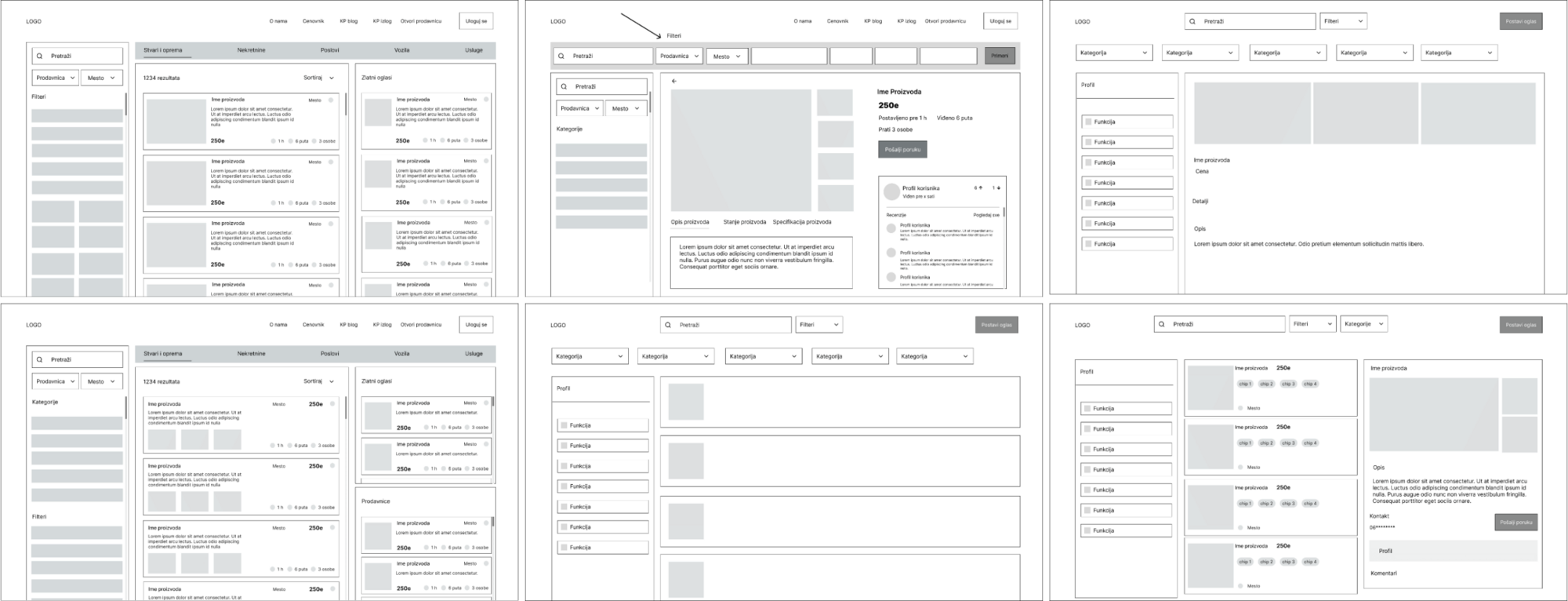
Wireframes
After experimenting with various layouts, I decided to adjust and update the current one with the goal of providing users with a faster and more efficient way to review ads. By making these changes, I was able to make the experience better while keeping familiar elements that users were already comfortable with.
visual design
Colors
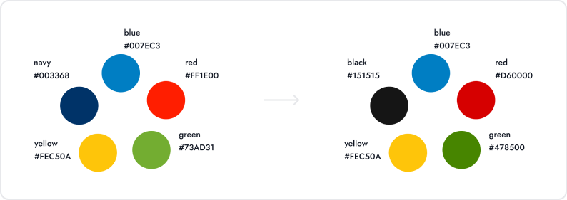
To maintain brand recognition, I kept the existing color palette with some minor adjustments. I noticed that certain colors had readability issues when paired with black or white backgrounds, or were too bright. To address this, I checked the color contrast to ensure compliance with accessibility standards.
Typography
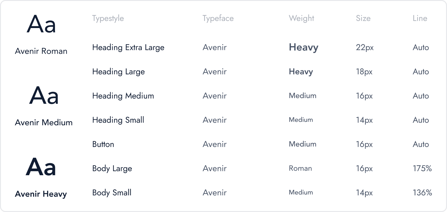
The website currently uses PT Sans as its typeface. While it offers good legibility, it can cause eye strain in this text-heavy design. To address this, I chose Avenir, which is well-suited for business and professional sites. Its versatility helps communicate professionalism while still feeling approachable.
UI elements
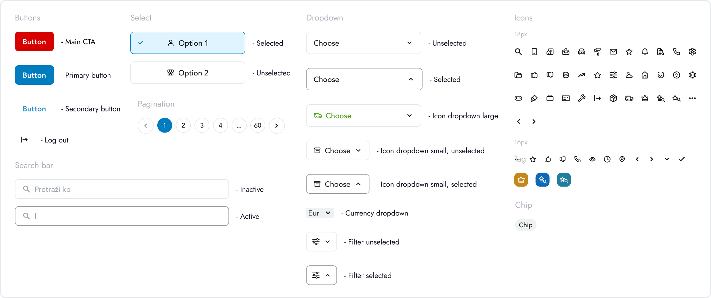
I kept most of the original design system but made some changes and added new elements where necessary. My goal was to make improvements while maintaining a familiar design for users.
redesign
Categories
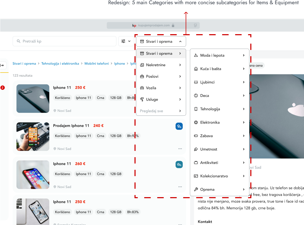
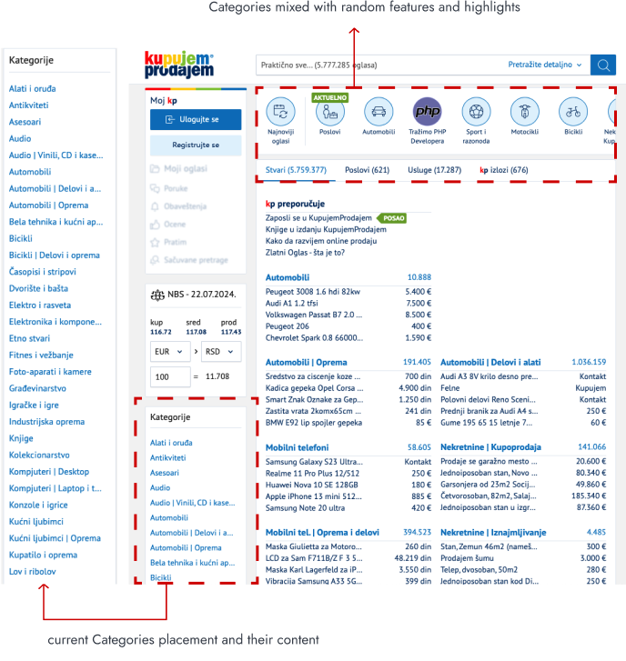
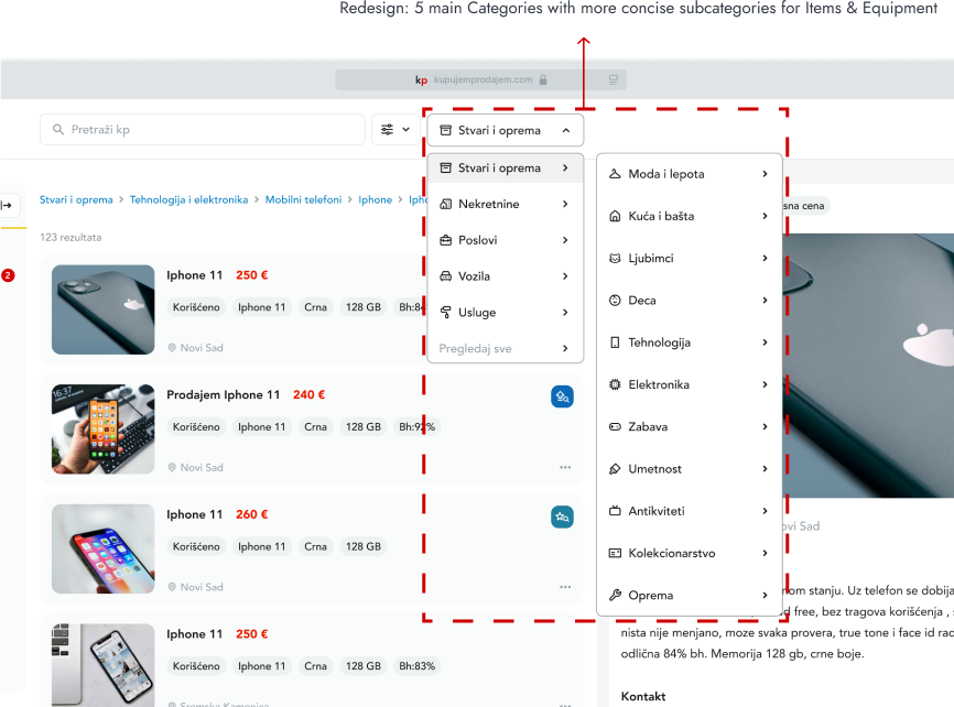
In the current version of the website, categories are located in the bottom right corner. On the homepage, two distinct sets of categories are derived from the main group, but their link-style design makes it difficult to identify and navigate to specific items. I chose to visually highlight key categories, such as jobs, services, cars, real estate, and items, to improve clarity and representation. I also reorganized the subcategories within the items and equipment section to make it more concise.
Filters
Current design

Filtering paid & promoted ads
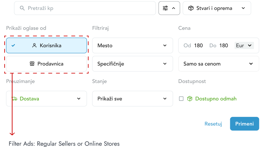
I added a new filter feature that allows users to differentiate between online stores and regular sellers. This makes finding the desired items easier and creates a level playing field: online stores compete with each other, while regular sellers do the same. This change retains the platform's business model while improving user experience.
Advanced filtering options
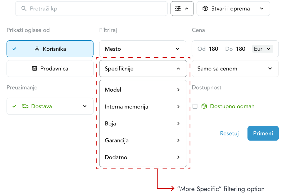
To go beyond the basic filtering options like price, location, and condition, I added a 'More Specific' section. After users perform an initial search, relevant filters appear to refine the results further. For example, if a user searches for 'iPhone,' they can filter by model, color, and other details, making it easier to find exactly what they need.
Results page
Visual markers
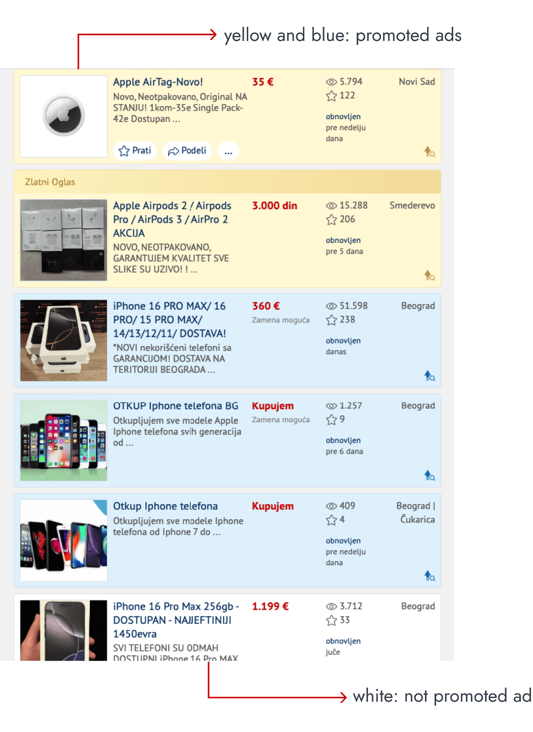
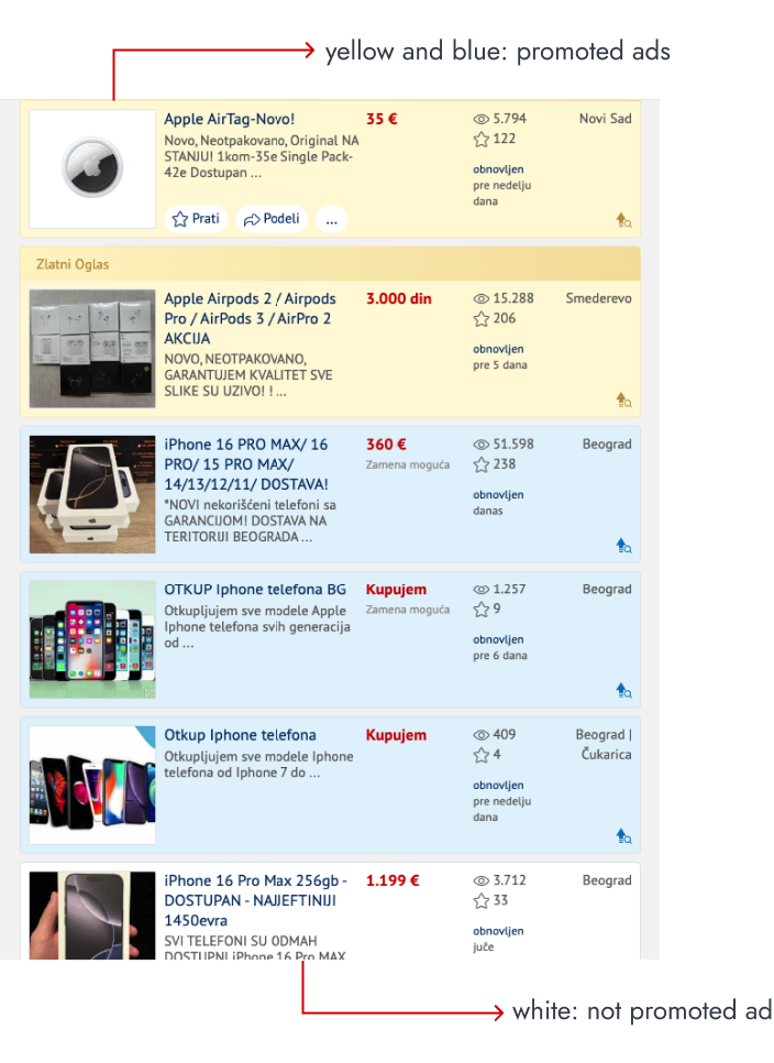
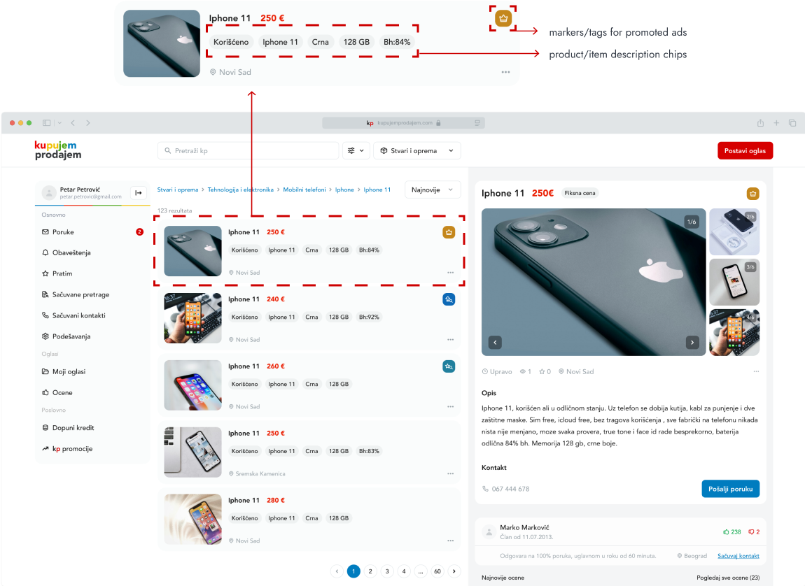
One issue on the results page was how promoted ads were presented. The current use of yellow or blue to highlight these ads disrupts the browsing experience, especially when multiple ads appear in a row. I simplified the visual markers for promoted ads, relying on existing business logic to keep them at the top of the page based on specific criteria.
Ad description
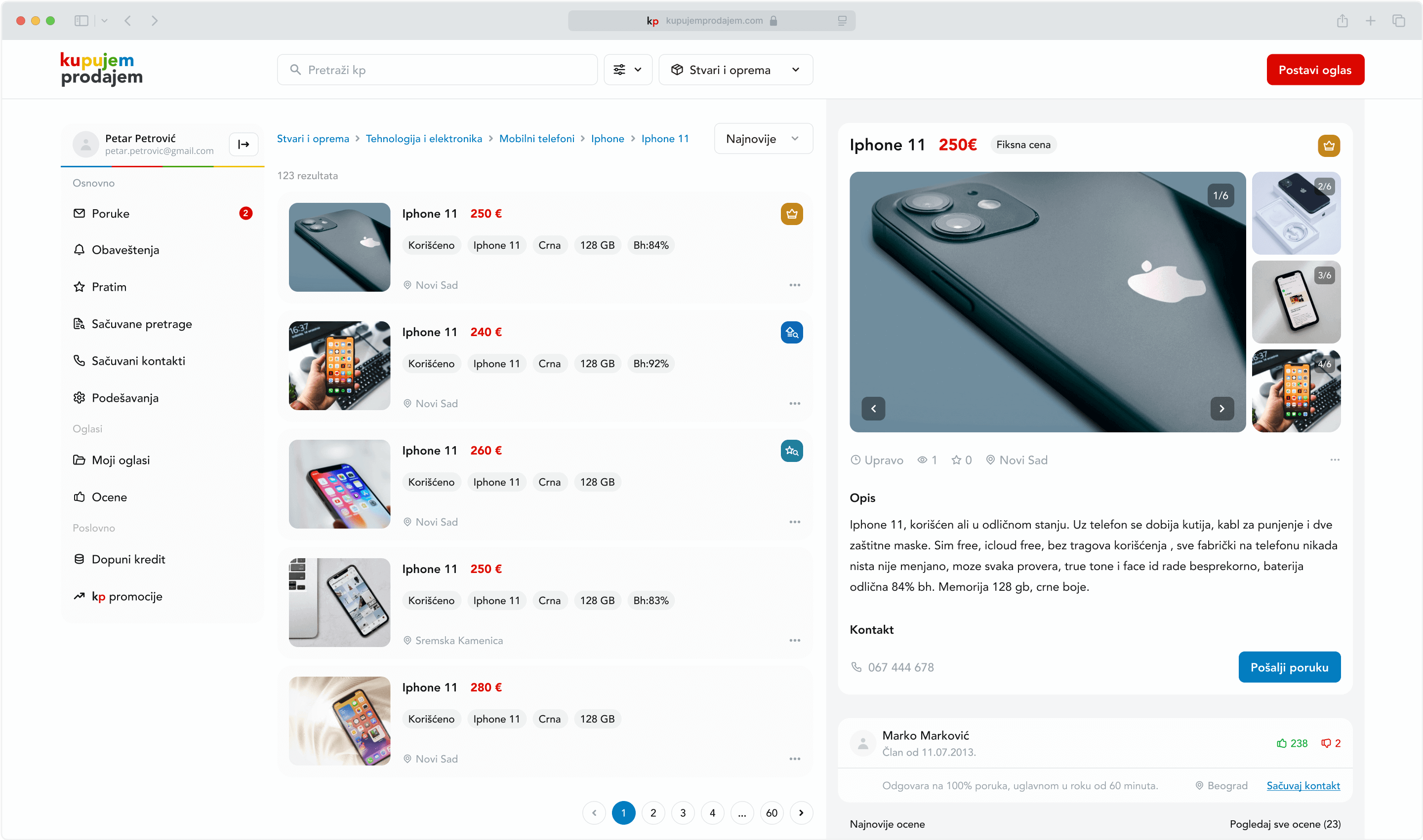
Currently, ad descriptions appear below the title, but the limited character count often leads to missing important information. Given that there's already a 'scan ad text' filter that analyzes the ad description, I decided to automatically enable this option. This way, users see generated tags instead of full text, making browsing easier and faster.
retrospective
What I learned
Since this was my first project, I learned how important it is to prioritize research and planning. I faced many challenges, had to start over a few times, and made plenty of design adjustments. These experiences taught me patience and adaptability, especially when things didn't go as planned. Feedback I received for this work showed me where I could improve, both in the product and in how I approached my work. This project taught me that being open to feedback can lead to better results and help me grow my skills.
Thanks for reading.
Project 02
Mobile app for discovering and creating events for real-life socialization

Project 02
Mobile app for discovering and creating events for real-life socialization
duration: 2 months
tools: figma
solo project

introduction
Problem
Over the past decade, social media has changed how we connect. We've gone from being part of large, open communities to sticking with smaller friend circles and more reserved interactions. This shift has left many people, especially those with fewer real-life friends, feeling lonelier. Online connections often don't translate into real-life experiences, leading to fewer meaningful social moments and missed opportunities.
research
Social media
This idea came to me while browsing online and reading posts on forums and social media. I realized these spaces would be perfect for gathering insights, so I focused my research on people who are active in these communities.
I assumed my target audience would be people aged 18-35, across all genders
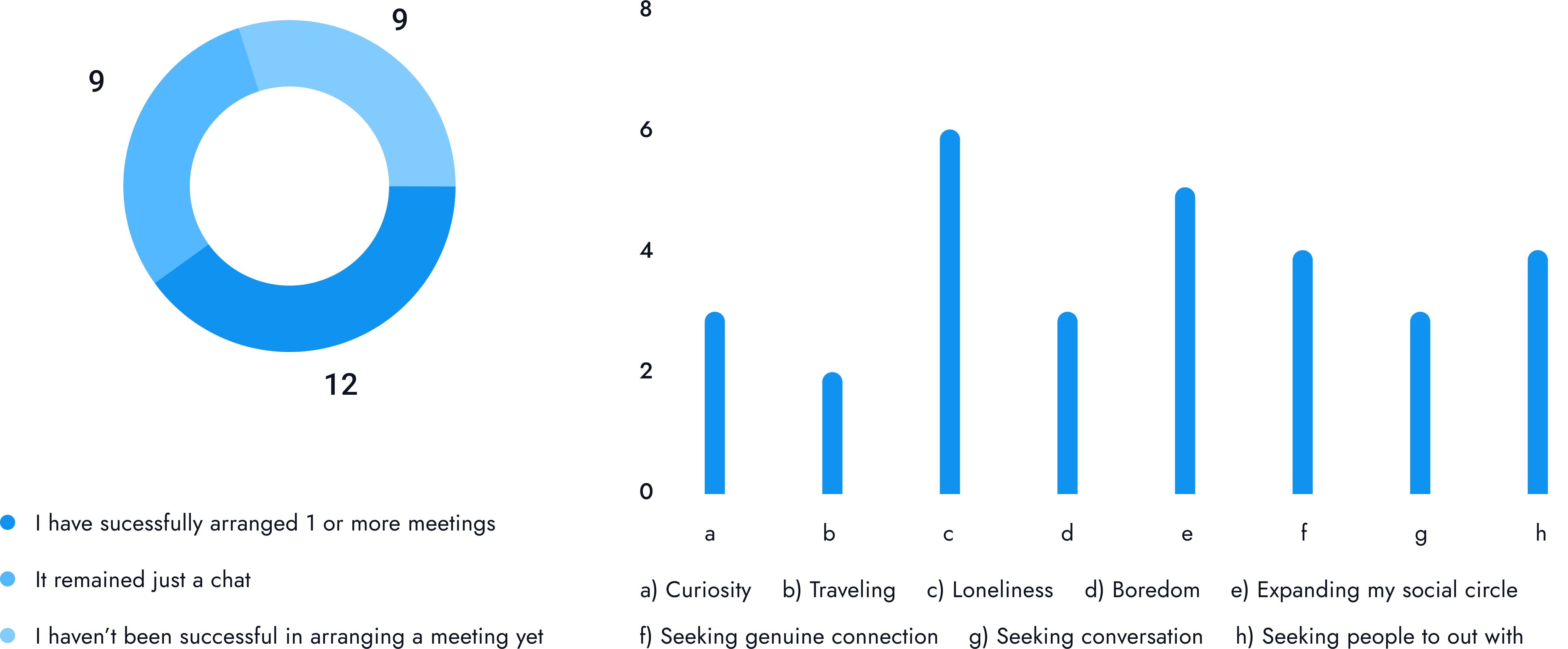
To gather data, I conducted a survey with 30 participants, asking questions like:
- Have you ever used friend-finding apps?
- What motivated you to use these apps?
- Which apps did you use?
- How successful were you in arranging real-life meetups?
User insights
To gain deeper insights, I interviewed a small group of people I knew who had used friend-finding apps. I asked them about the challenges they faced, and here are some of their responses:
"I'm an introvert, so approaching or messaging someone first makes me anxious. Sometimes I just don't know what to say."
"I'm too busy and don't have time to check in regularly."
"I feel a lot of pressure to make my profile appealing so others will be interested in me."
"It feels awkward to swipe through people, and sometimes I accidentally swipe too much, leaving no one else to see."
Competitor analysis
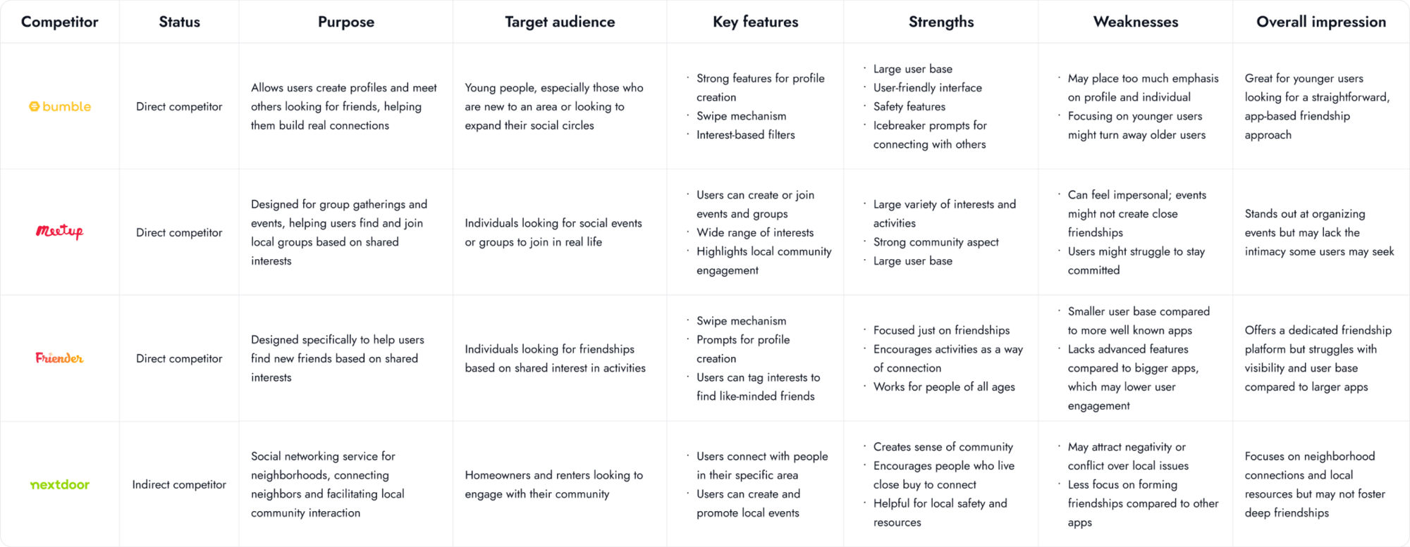
In the final phase of my research, I looked into competing apps like Bumble BFF, Meetup, Friender, and Nextdoor. I explored their approaches, target audiences, similarities, differences, strengths, and weaknesses.
defining the problem
Affinity map
To organize all the information, I created an affinity map. This helped me identify users' motivations, obstacles, and wishes when using friend-finding apps.


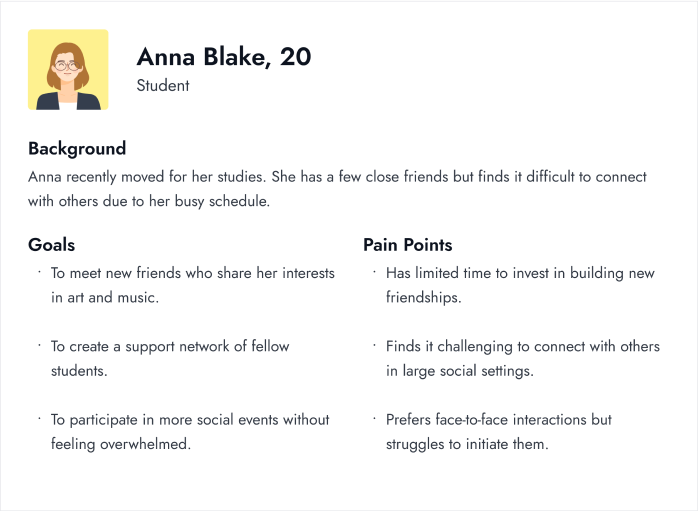
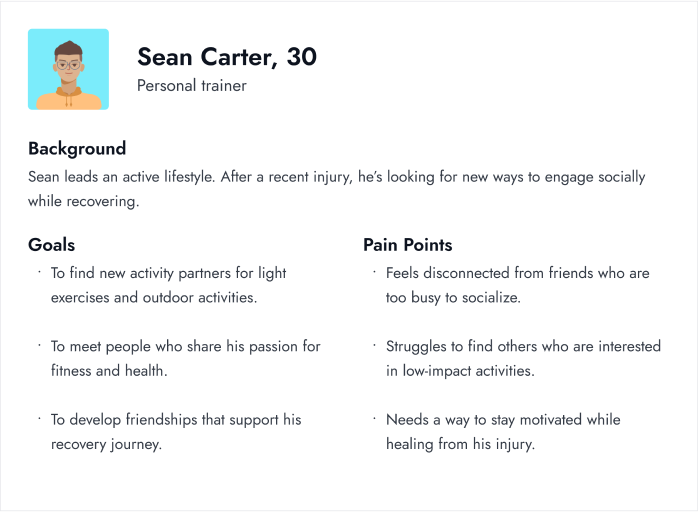
Personas
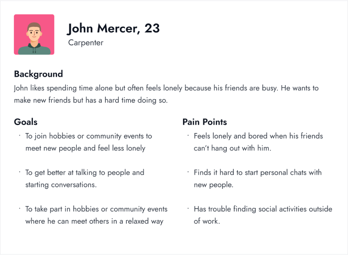
Based on my findings, I created three personas to represent different types of users, each with their own needs, motivations, and challenges.
ideation
Crazy 8s
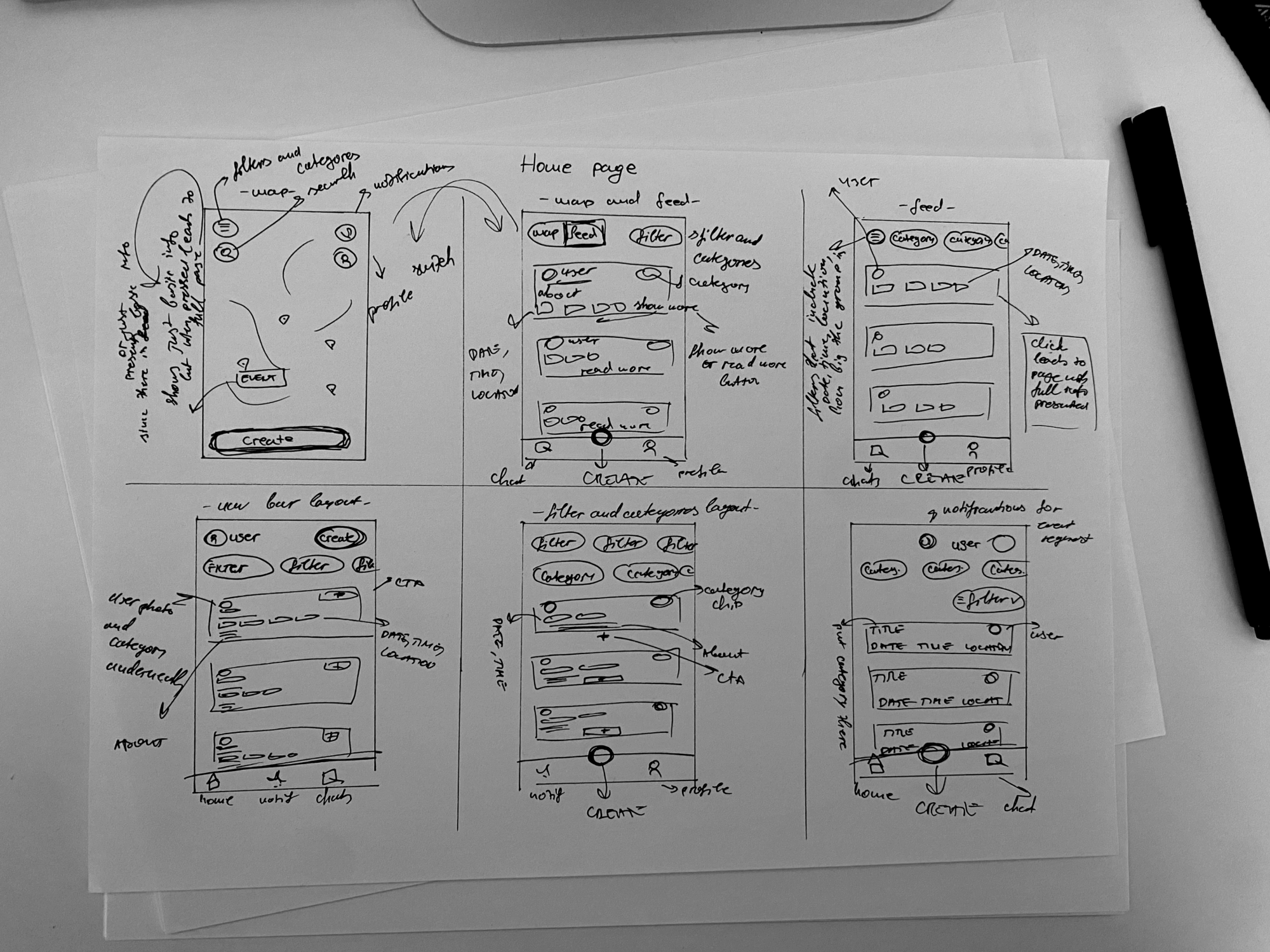
With my research insights in hand, I used the Crazy 8s technique to brainstorm key features for the app. In eight minutes, I sketched eight different solutions to explore a variety of ideas. I then chose the most promising one based on what would work best for the target audience.
visual design
Colors, typography and UI elements
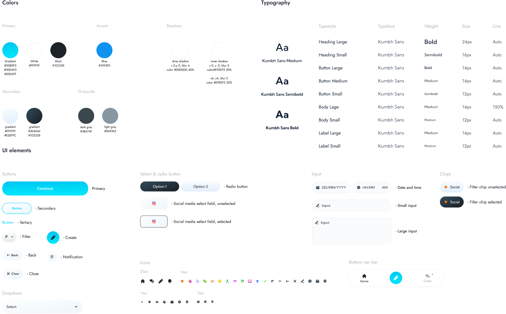
The design system uses bright colors to create a welcoming vibe, with blue and teal providing a calming effect and black offering contrast. Gradients add depth, making the app fun and engaging. I chose Kumbh Sans as the main font because its geometric, rounded style enhances the friendly feel of the app. Different font sizes and weights make headings and body text clear, while buttons and input fields are designed for ease of use.
design
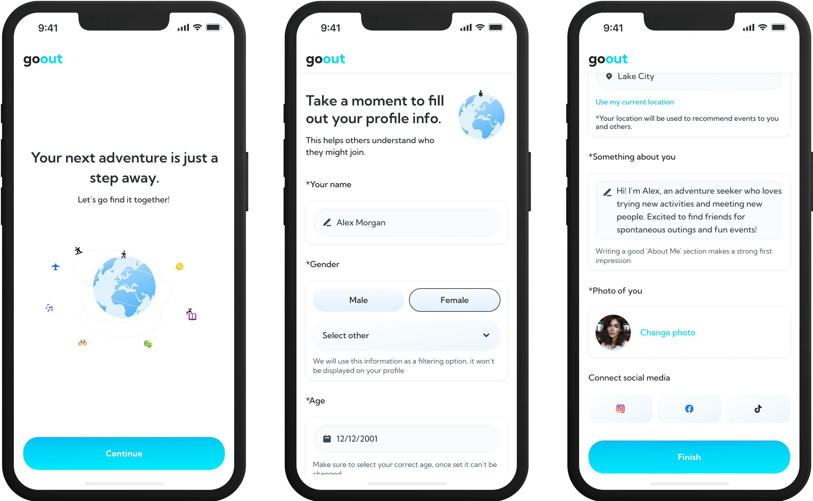
Onboarding
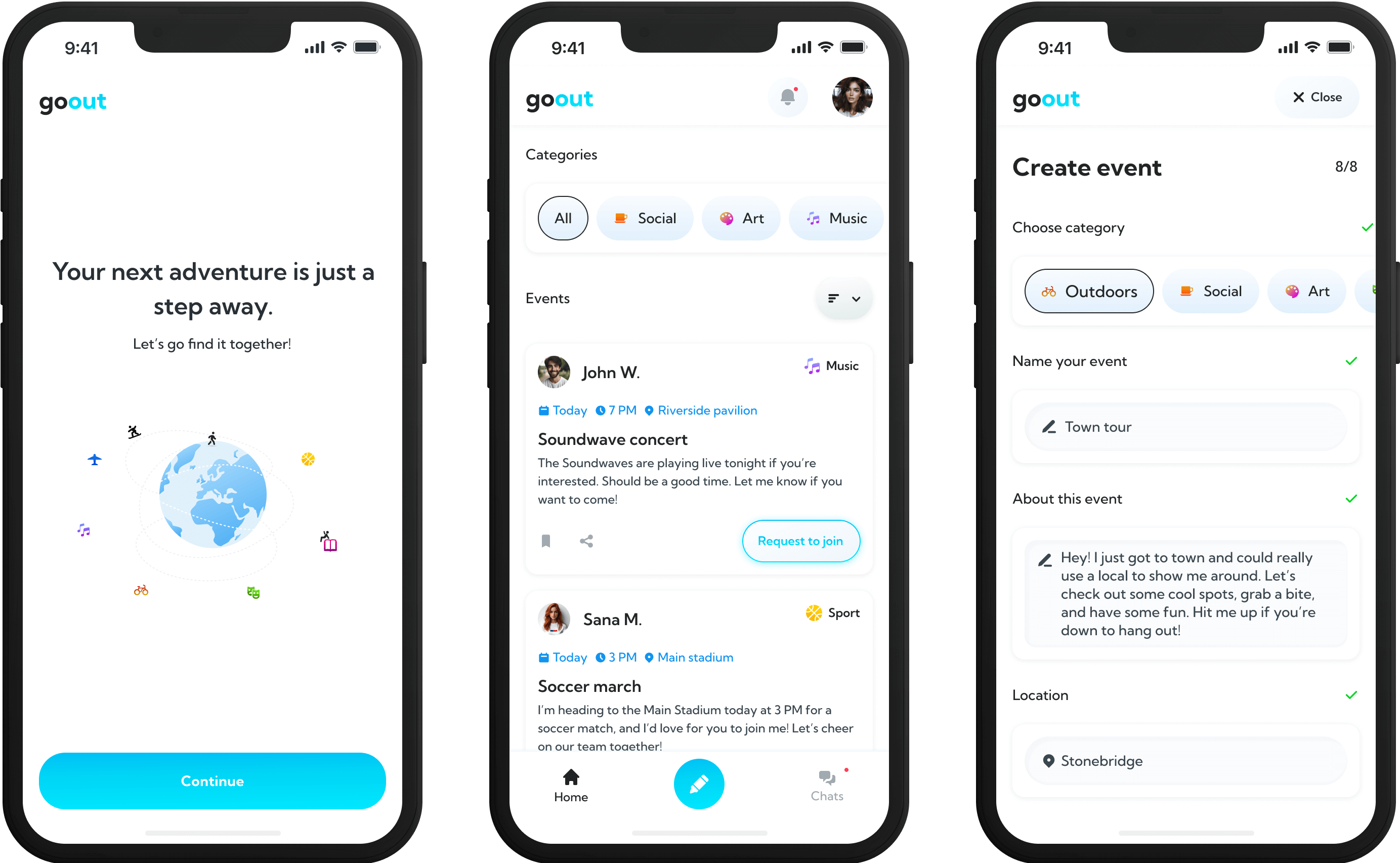
During onboarding, users fill in basic information like their name, age, location, a photo, and an 'About Me' section. They also have the option to link their social media accounts for additional verification. Once completed, they are ready to explore the app.
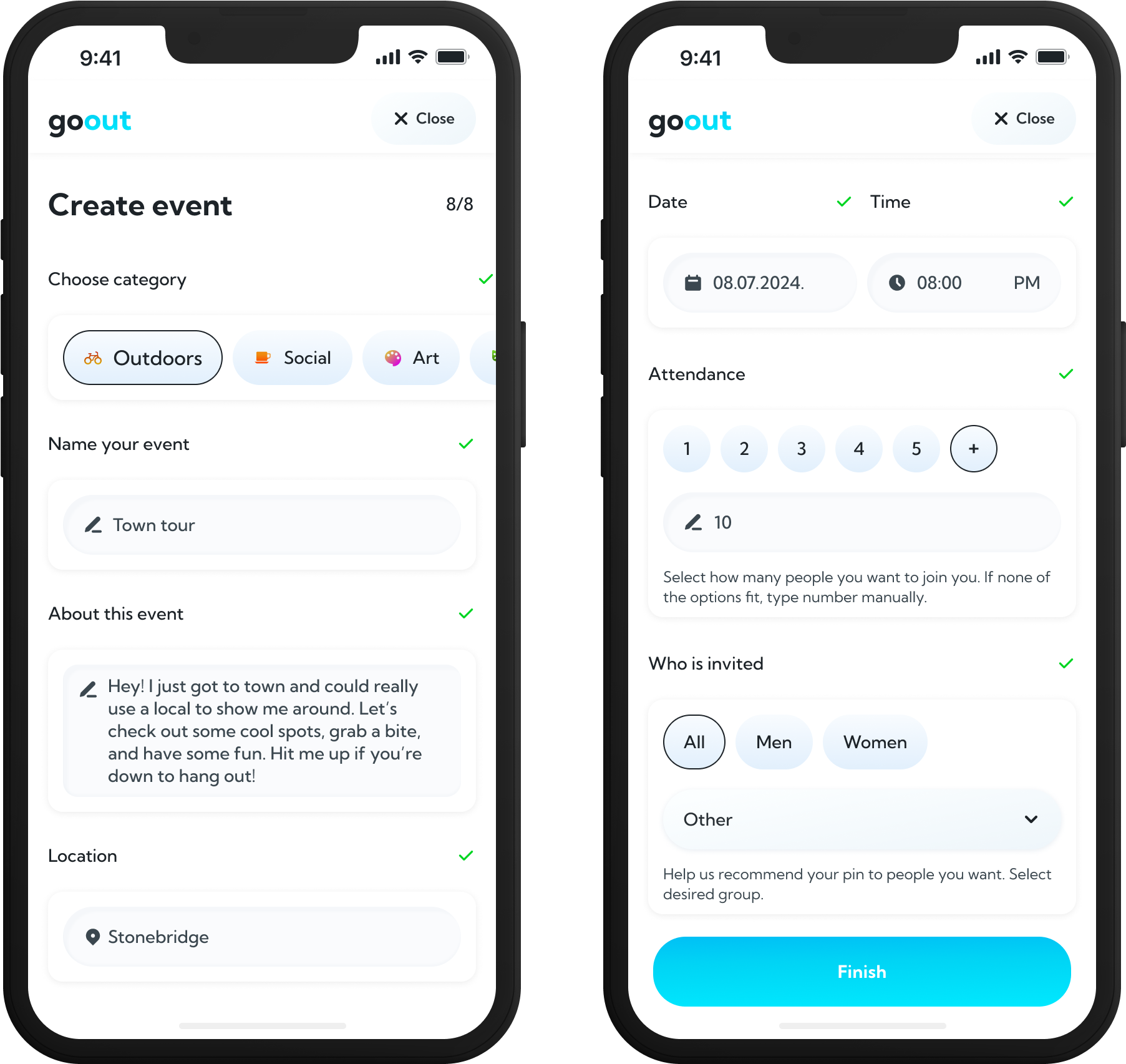
Create your event
Creating an event involves an 8-step process that gathers essential information. Users need to provide details such as the event’s category, title, and description to help potential attendees understand what to expect. They then enter the location, date, and time, set attendance limits, and specify the gender of invitees to effectively target the right audience. A short help tool guides users through each step.
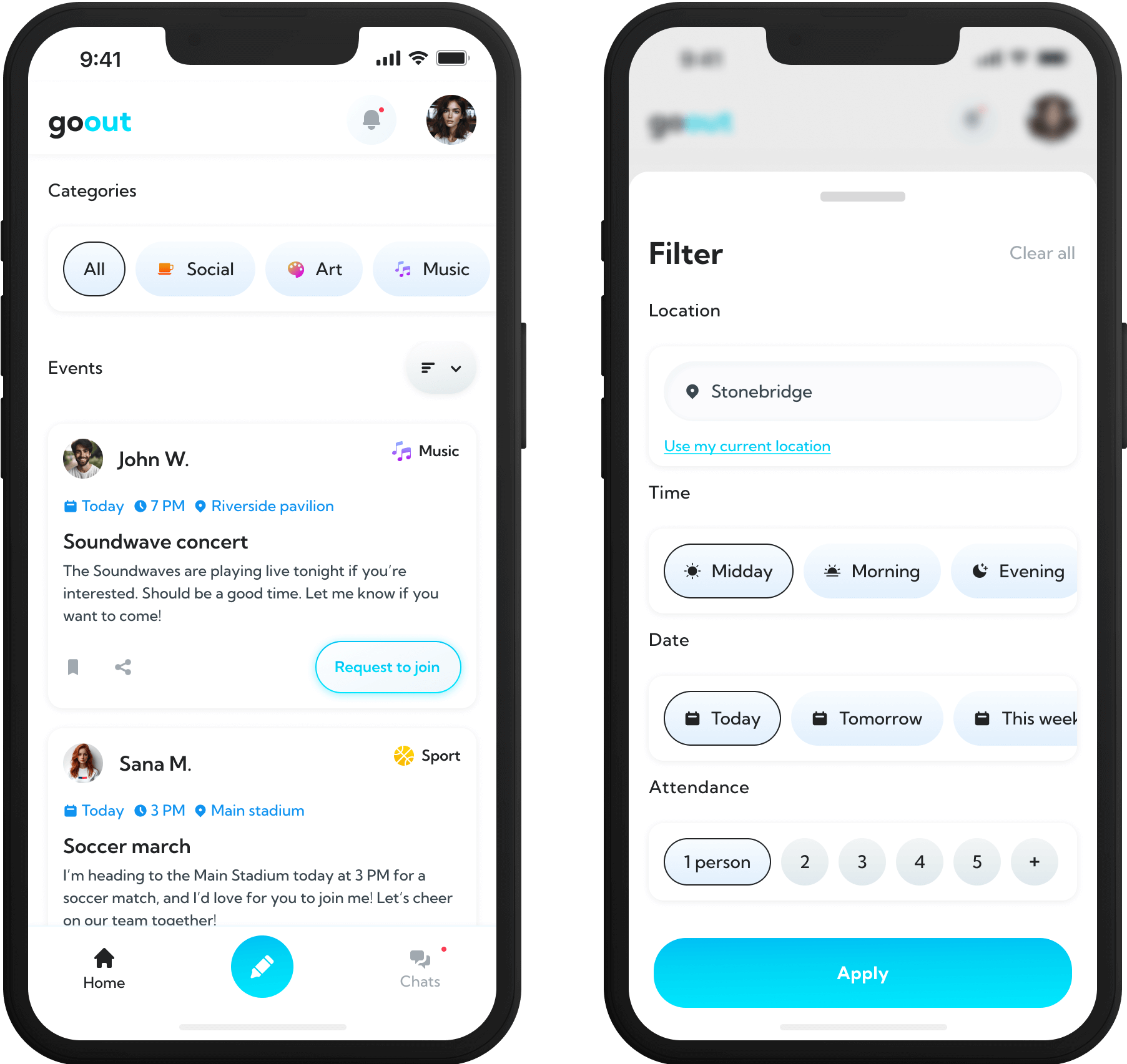
Find events
At the top of the homepage, users can quickly access categories and use filters for easy event discovery. Filters allow sorting by location, date, and number of invited guests. The feed is designed in a clean, minimalistic way, with colorful categories to make it easy to scan. Basic event details are displayed initially, and clicking on an event provides more in-depth information.
retrospective
Final thoughts
After finishing this project, I see plenty of room for future improvements, such as adding new features and refining what’s already there. User feedback will be crucial in determining what works well, what needs tweaking, and what new features to introduce. Future updates could focus on improving event discovery, adding prompts to encourage connections, involving larger event organizers, and incorporating more social features like posting moments, sending friend requests, and using filters like 'currently happening.' These ideas will need validation through user testing.
Thanks for reading.
Project 03
Notification service for newly available rental property listings

Project 03
Notification service for newly available rental property listings
duration: 1 month
tools: figma
team: myself & product developer

introduction
Overview
Recent global inflation has driven real estate prices higher, turning property searches into a competitive race. Finding quality rental properties at fair prices and securing them quickly has become increasingly difficult. With this in mind, the idea for this project was sparked: to create a service that notifies users whenever new rental ads are posted.
project insights
Features
After discussing with the product developer, we decided to start with an MVP version of the rental listing platform. This approach allows us to focus on delivering the core features first while leaving room for future updates and improvements.
Rental filters
Users can set criteria such as location, price range, property type, and amenities—similar to what is available on most rental listing websites.
Display of received notifications
A dashboard will display real-time updates on new listings and important alerts, keeping users informed about relevant opportunities.
Review of received ads
Users will have a dedicated section to review and manage the ads they receive. They can save their favorite listings, view detailed information, and easily compare different options.
Payment system
A secure payment system allows users to manage their transactions, such as purchasing credits or tokens to access premium features or listings.
Notification preferences
Users can choose how they want to receive notifications - via SMS, email, or in-app alerts, allowing them to personalize their experience.
research & IA
Summary
Since there are no direct competitors in our region, I focused my research on the services and features offered by real estate agencies and rental listing websites. I examined how they present information and organize their forms. Based on this research, I created the information architecture for our website.

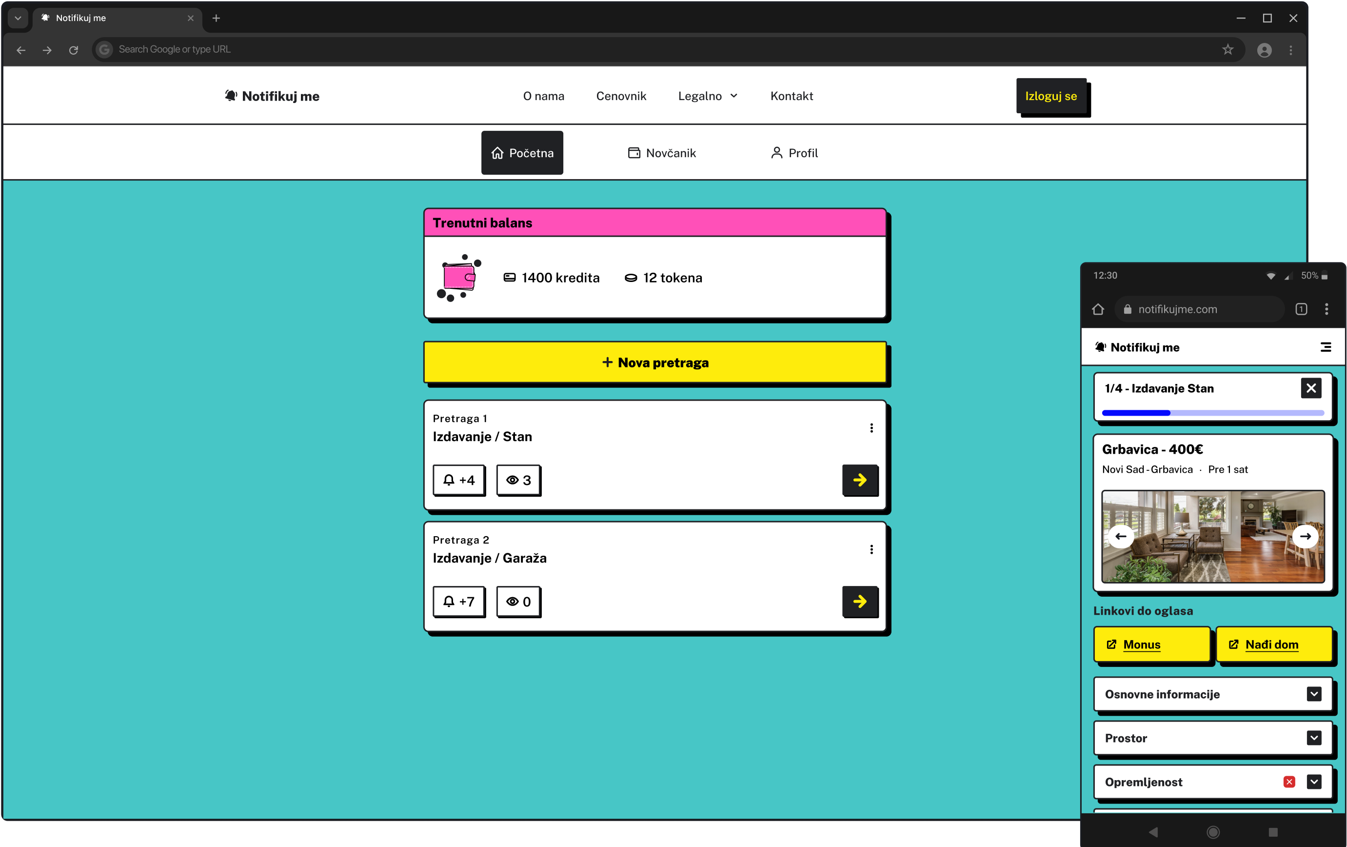
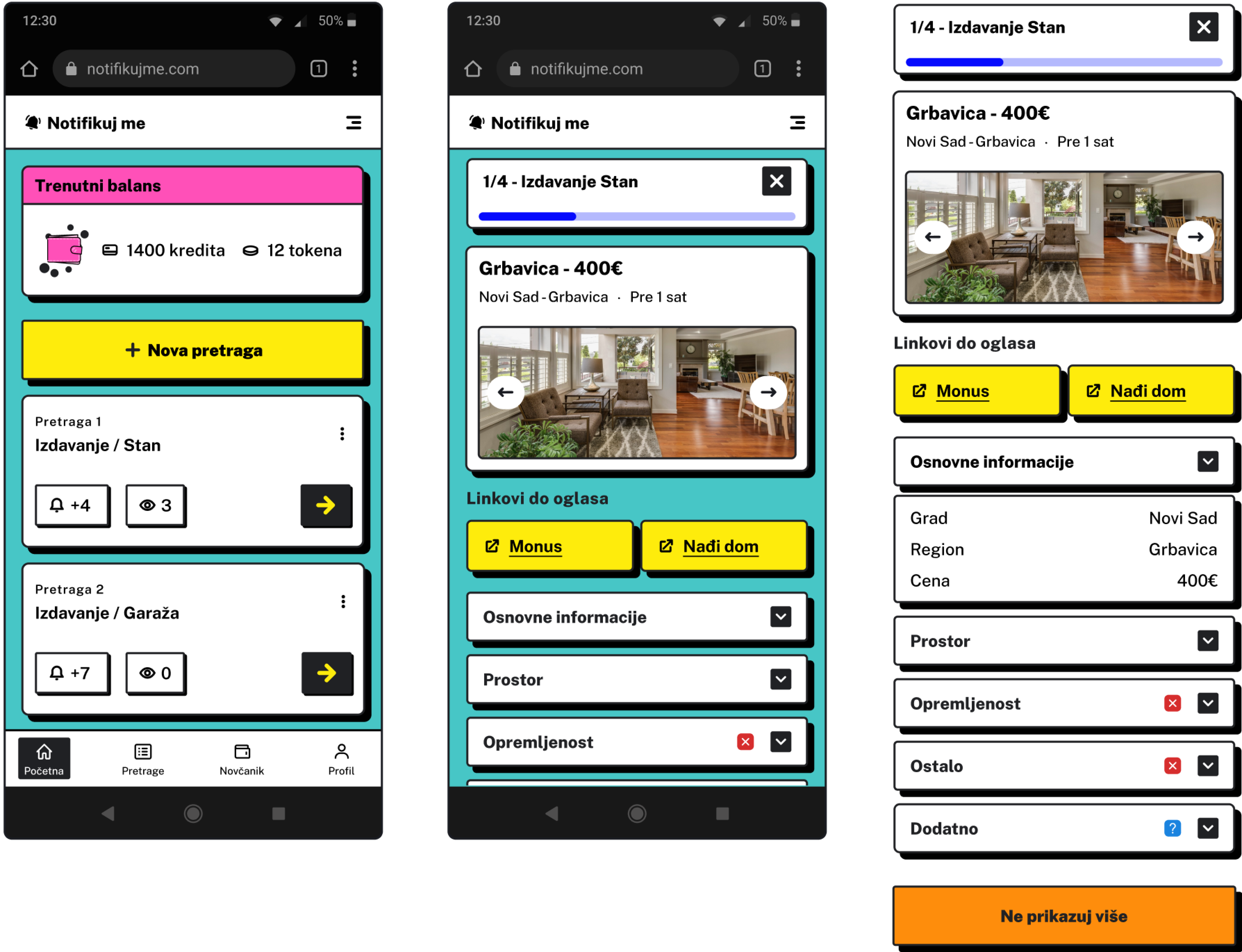
Instant access to new ads and notifications
Users can access their latest notifications immediately, with each search providing live updates of new and unreviewed notifications that can be checked instantly. They can also review all their notifications at once, with direct links to the original ads and an analysis from the website's bot highlighting any missing filter criteria. Additionally, users can block certain ads to avoid seeing the same listings again.
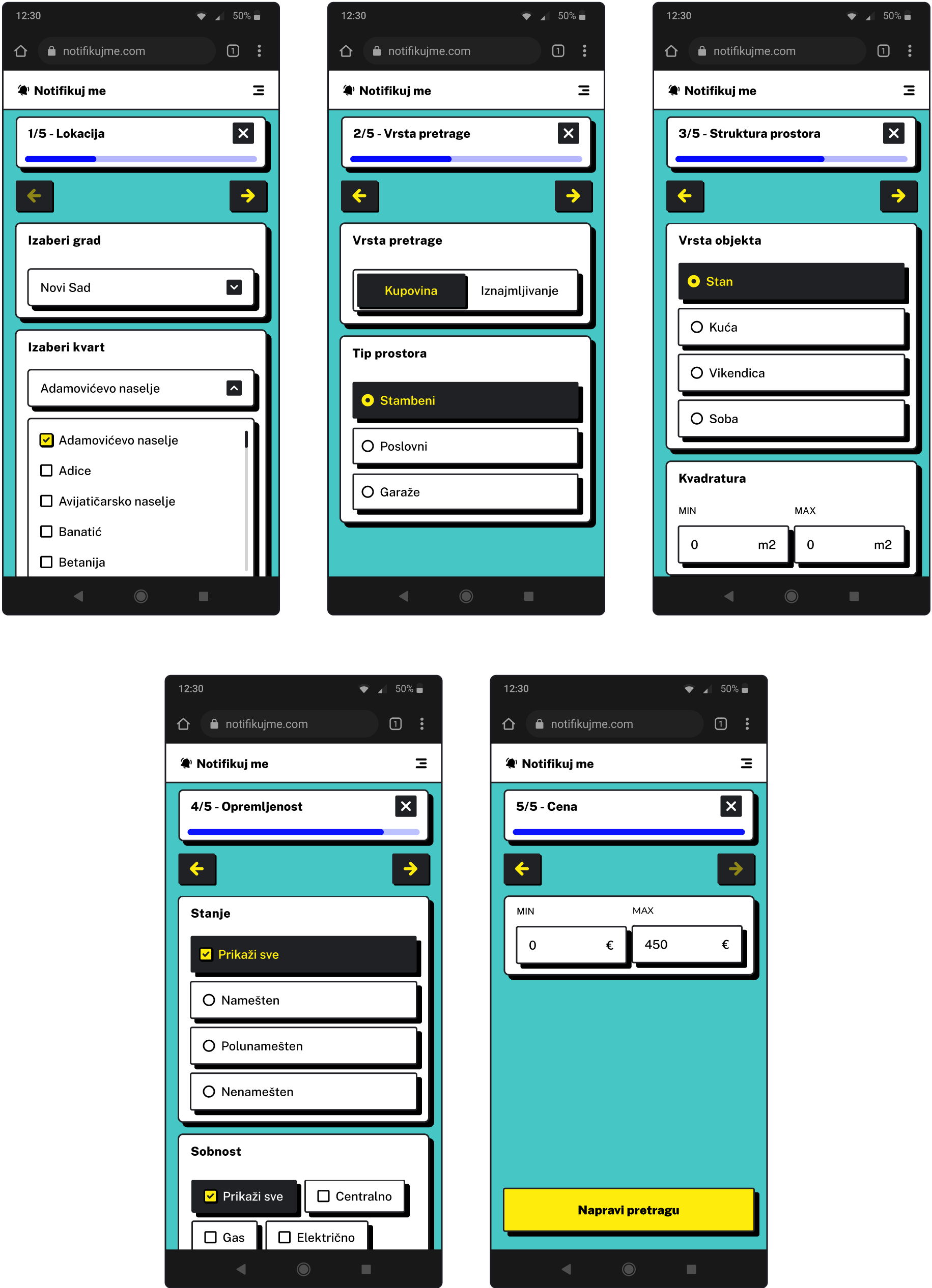
5 steps
Users can create their search in five easy steps: enter the location, type of search, details about the space and amenities, and set the price. Once saved, the service's bot will send all matching ads from different agency websites based on the filters provided.
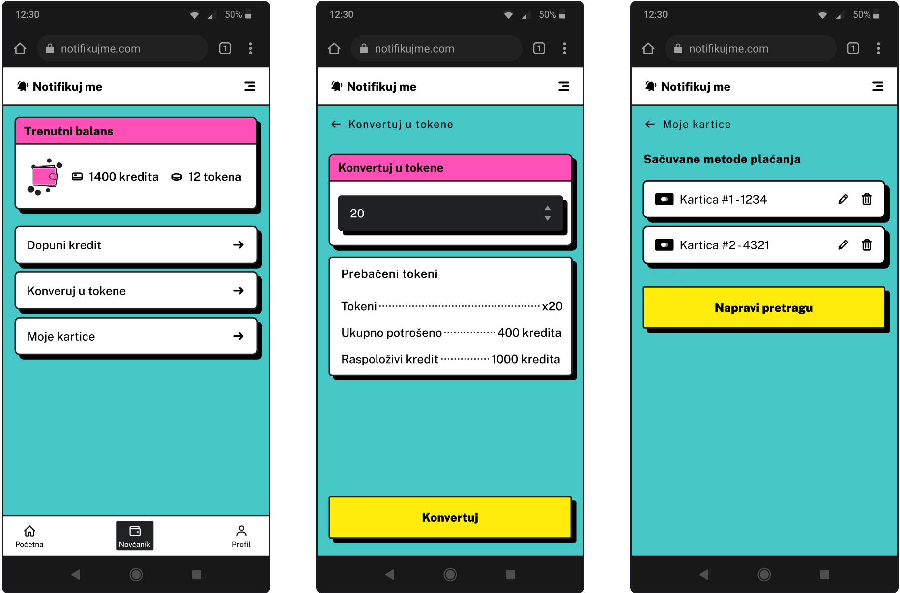
Flexible payment
With a pay-as-you-go system, users only pay for what they use. This way, they can control their spending without making unnecessary commitments. Tokens can be purchased from their wallet and are deducted with each new notification.
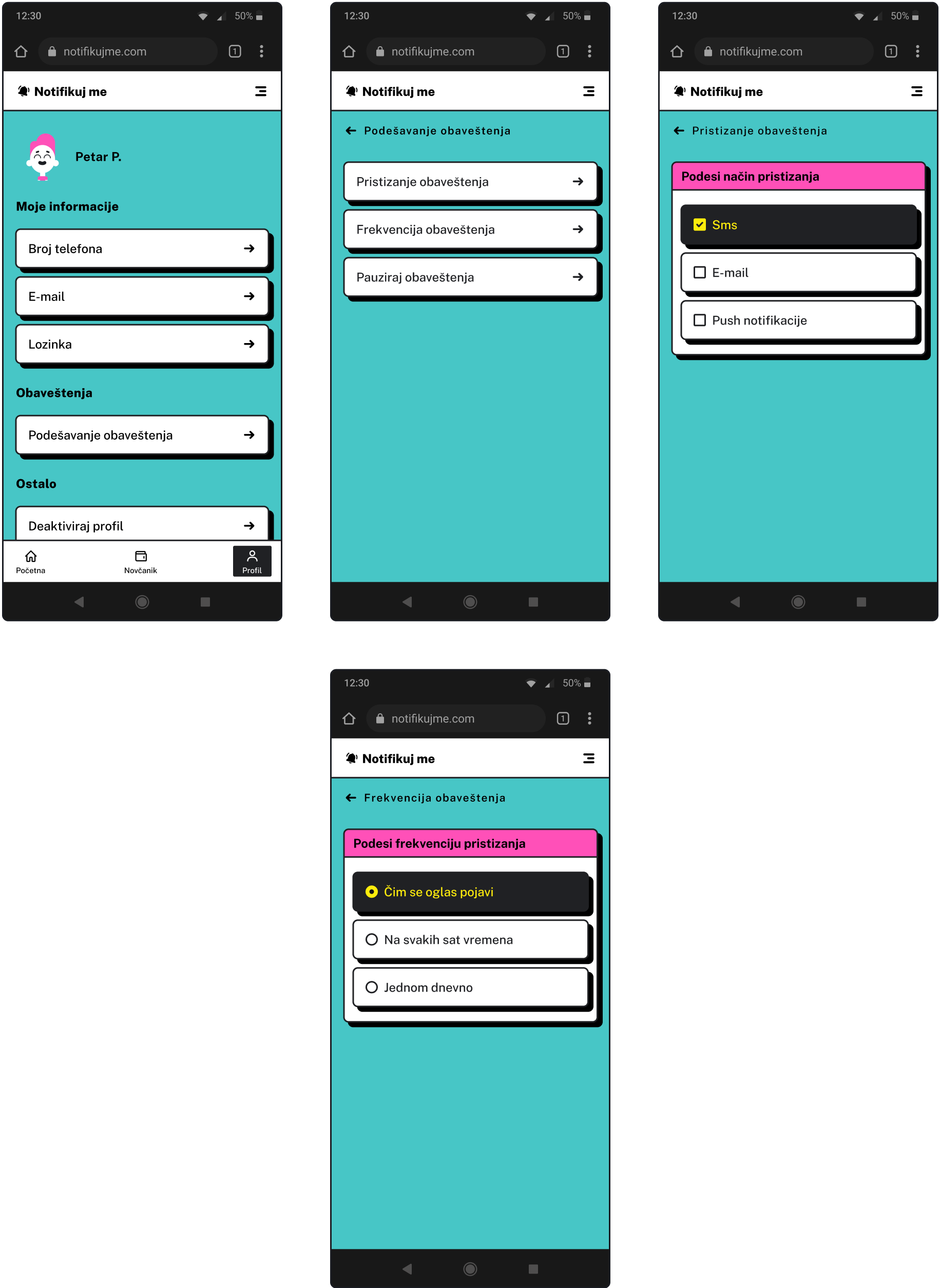
Stay notified
Users can choose how they'd like to receive notifications - via SMS, email, or website push notifications—ensuring they stay informed in a way that suits them. They can also set their preferred notification frequency, giving them control over how and when they receive updates.
Thanks for reading.
Project 04
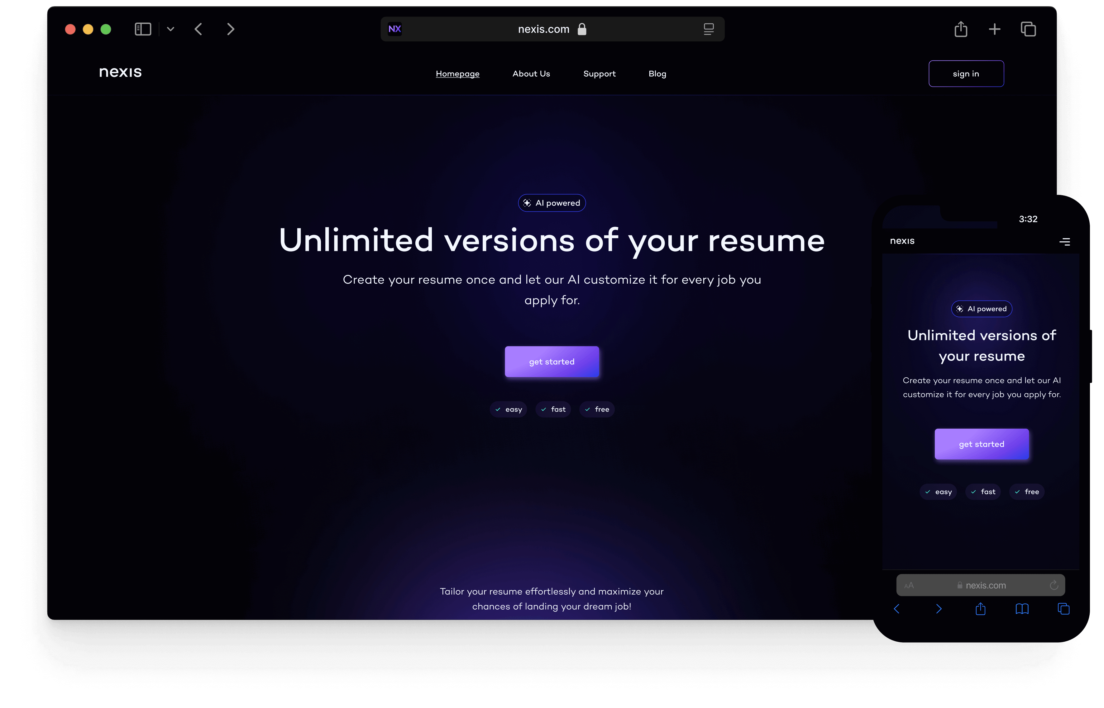
Home page design for an AI resume creation service

Project 04
Home page design for an AI resume creation service
duration: 2 weeks
tools: figma
solo project

introduction
About this project
I took on this fictional project as a personal challenge to improve my design skills by experimenting with modern design concepts. It provided an opportunity to push myself creatively while honing my abilities. Through this challenge, I aimed to showcase the key features and benefits of the service in a visually engaging and story-driven way.
research
Competitor analysis
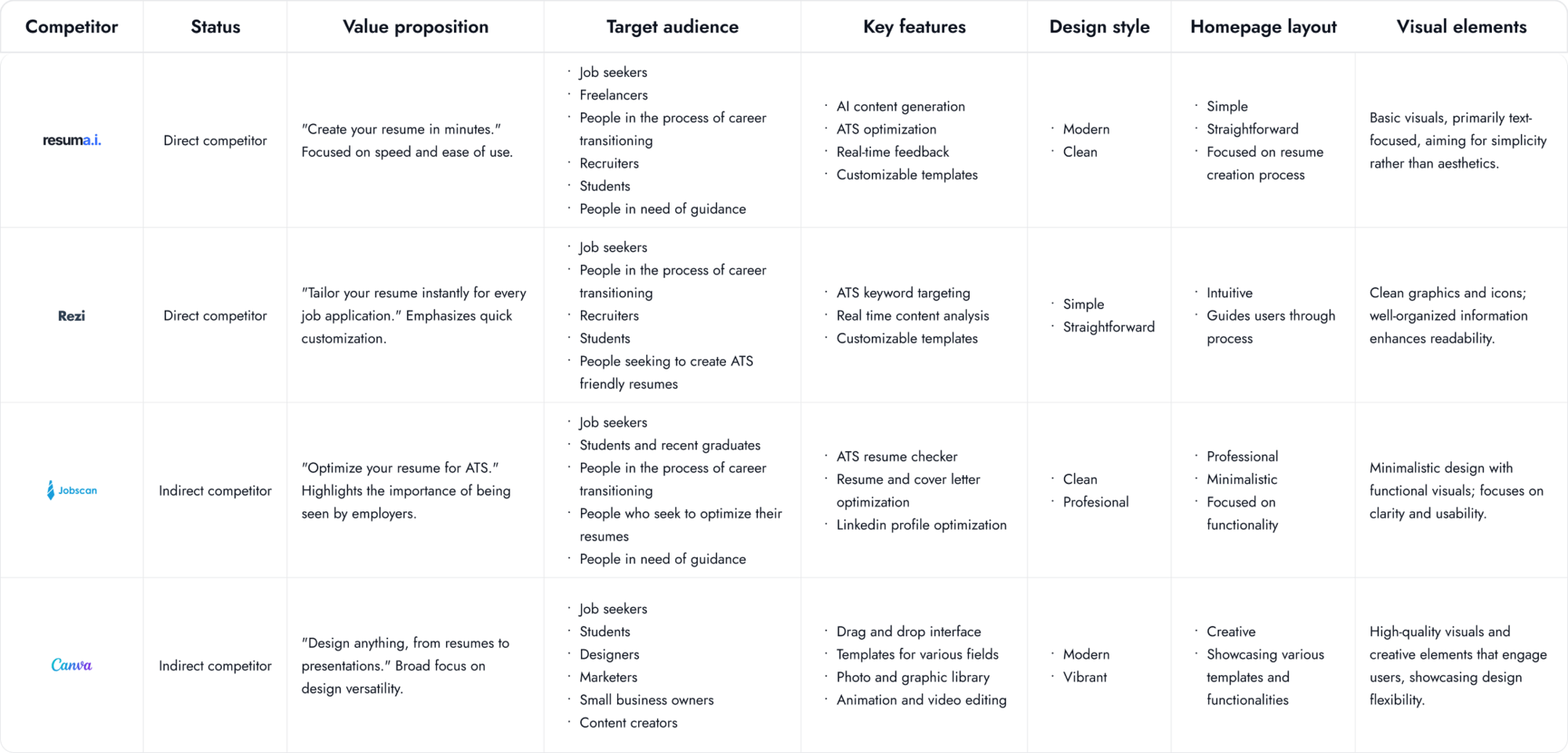
I started by reviewing several resume builder websites to understand their offerings and target audiences. I analyzed their designs, homepage layouts, and visuals to identify what worked well and what could be improved. This helped me gain a clearer understanding of what job seekers value in these platforms and how the competition compares.
define
Personas
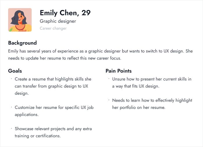
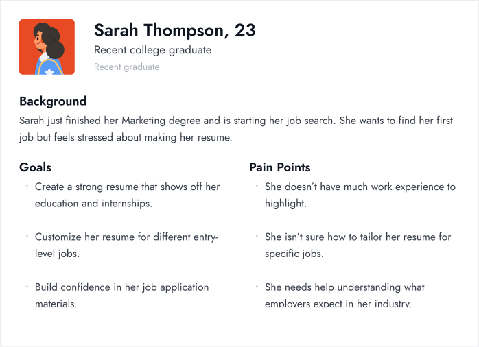
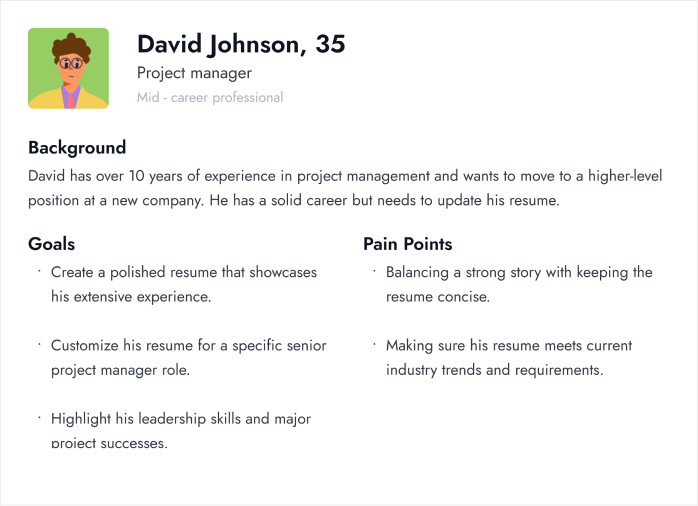
After conducting competitive research, I created three user personas to gain a deeper understanding of the needs and challenges faced by different job seekers. Each persona represents a unique background, set of goals, and struggles in the job application process. This helped me identify how a resume builder could support them in their specific situations and improve their chances of getting hired.
ideate
Wireframe
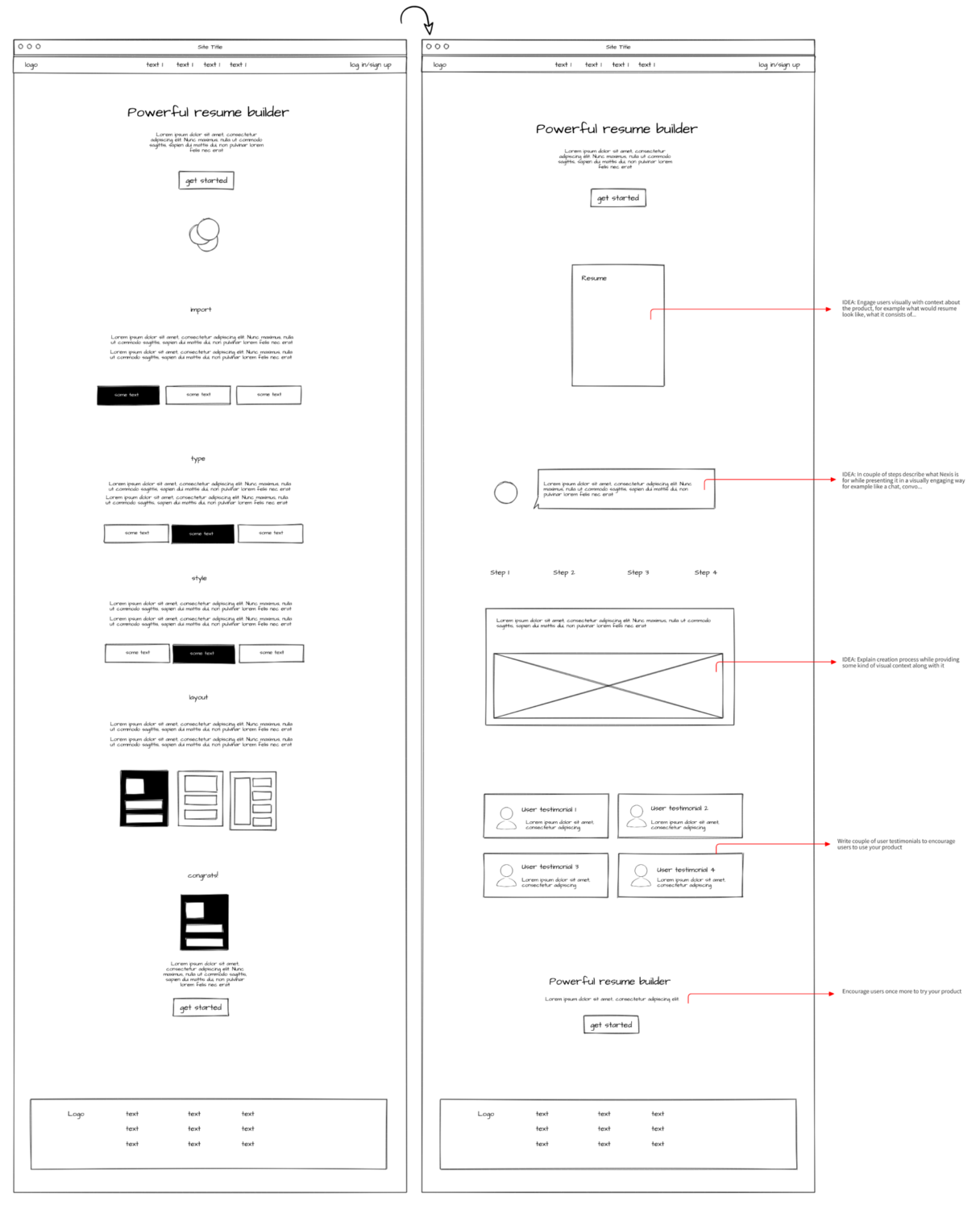
While working on the wireframe, I also began planning the page content. I reviewed layouts from other resume-building websites to understand which elements are crucial for a homepage like this. This research helped me create a more effective and user-friendly layout.
visual design
Experimenting with styles
When deciding on the visual style, I explored several options and ultimately chose a dark theme, inspired by 2024 design trends. The dark theme adds a sophisticated, modern feel, making key elements stand out clearly. It also creates a visually striking contrast, drawing attention to important features and helping users stay focused on the content.

Colors
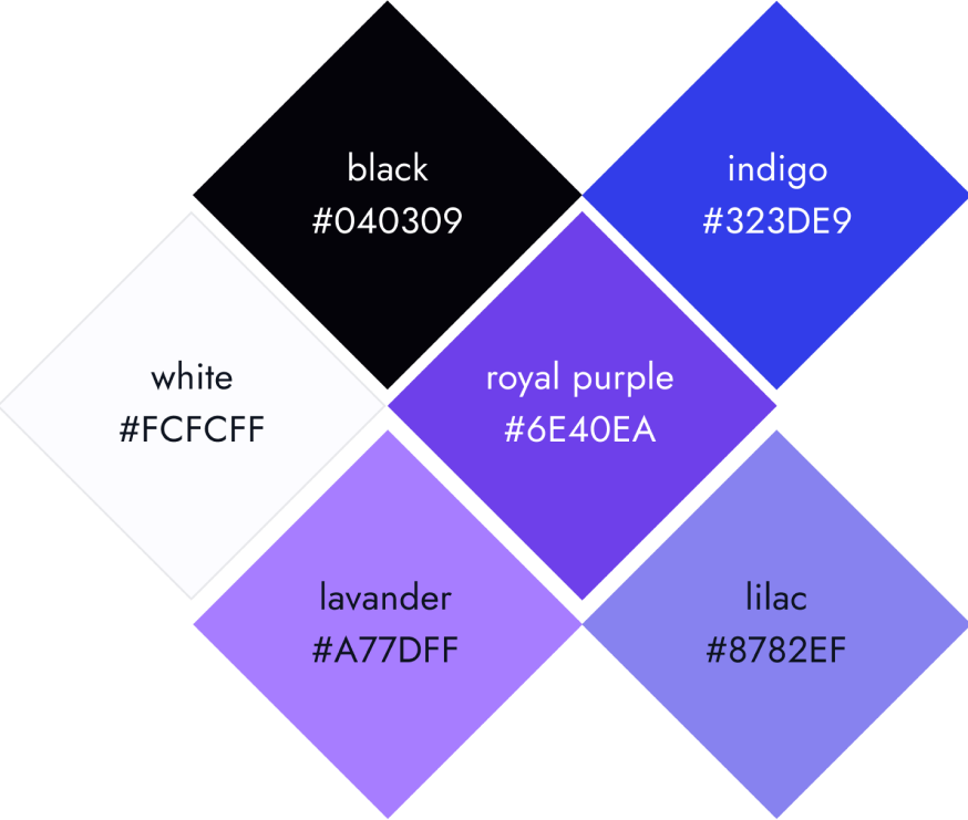
The colors I chose were intended to create a modern, clean look that effectively highlights the AI features. The darker tones ensure the content is easy to read and navigate, adding a sophisticated, high-tech feel. This choice fosters a calm environment where users can focus on building their resumes. Overall, the color scheme aligns with Nexis's mission to provide a powerful, user-friendly resume-building tool.
Typography
For this project, I wanted a font that was both easy to read and had a futuristic touch, making Campton the perfect choice. Its clean lines and modern design not only improve readability but also create a user-friendly experience that aligns well with the website's style.

design
Desktop experience


Mobile experience


retrospective
Final thoughts
I'm really glad I had the opportunity to work on a project like this because it allowed me to practice and expand my knowledge of design styles as well as UX principles. I also had the chance to learn about new technologies and gain a better understanding of how business and marketing work. This project gave me valuable insights into balancing user needs with business goals, and the importance of effective communication through design.
Thanks for reading.


